Student-Created Infographics and a Seated Poster Session: Two Experiments in Teaching Statistics
This past spring I taught Math 216, an introduction to statistics for engineering majors, for the fourth time in recent years. In order to make the course a bit more lively for me and for the students and to reflect the growing importance of visualization techniques in statistics, I added some material on data visualization to the course.
Early in the course, we looked at several types of visualizations that go beyond the usual histograms and stem-and-leaf plots you see at the beginning of every statistics book. Check out, for instance, this bubble chart displaying executive salaries or this live heatmap of tweets made around the world or this interactive treemap of earthquakes since 1900. I wasn’t expecting my students to create data visualizations as slick as those examples, but I did want them to think outside the boxplot. And they did! Check out these visualization sketches my students brainstormed back in January.
For my students’ final projects, I asked them to apply the statistical techniques they’ve learned to some “real world” problem. This is an assignment I’ve given in every offering of this course, but this time, instead of sharing their work in a five-page paper, I asked them to create infographics–digital posters that use test and images, including data visualizations, to communicate information. (For some professional infographics, see these recent infographics from the website GOOD.)
My students did a great job with this assignment, in spite of the fact that this was a new genre of report for them and that I didn’t have any examples of past student infographics to show them. To address these challenges, I enlisted my students help in “crowdsourcing” a rubric for evaluating statistically-savvy infographics. By involving them in the creation of the rubric I would later use to grade their projects, I hoped to give them a better understanding of my expectations. Over on my personal blog, I’ve described the process I used to create this rubric with my students, for those interested.
In past offerings of this course, I’ve organized a student poster session on the last day of class, giving students an opportunity to see the good work of their peers. This semester, however, the fact that I have 70 students and a pretty small classroom meant that a traditional poster session wouldn’t work. Instead, we had a “seated poster session” in which the students were stationary and the posters circulated around the room. I was glad to see most of my students highly engaged in this process, making many lively comments about the infographics their peers designed. Again, over on my own blog, I’ve shared a few more details about and reflections on this seated poster session.
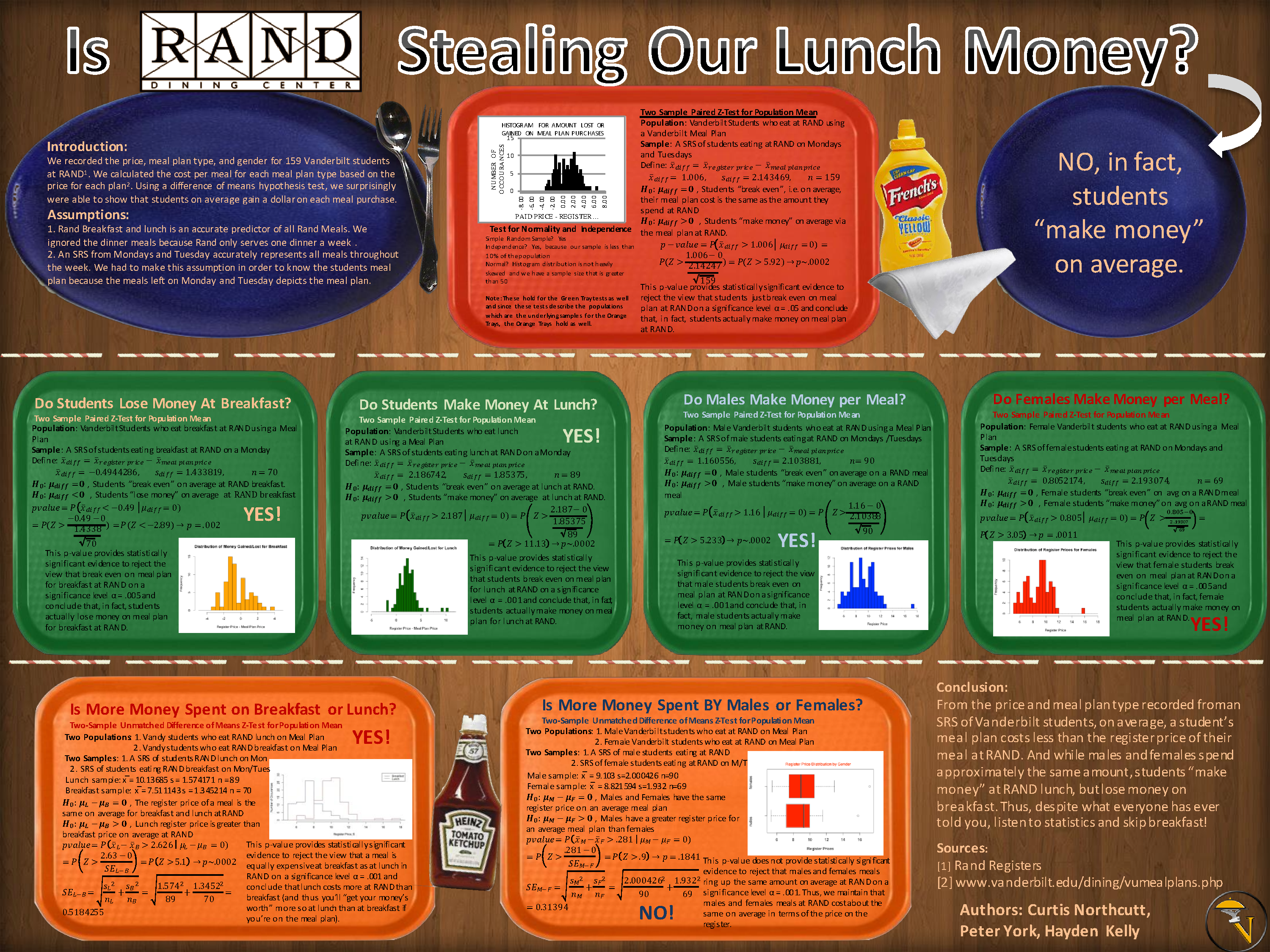
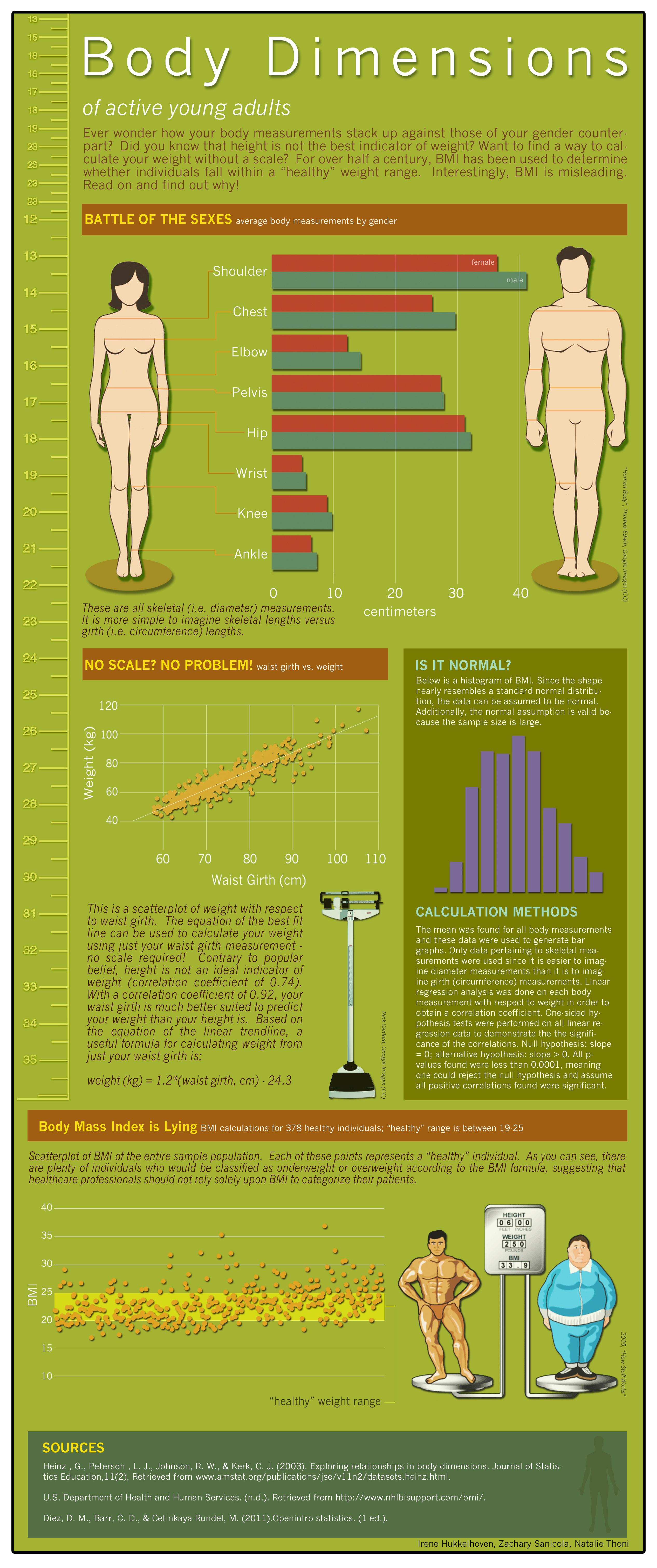
To give this seated poster session a bit of structure, I had my students vote on their peers’ projects in three categories: Most Interesting Application, Best Data Visualization, and Most Attractive Infographic. Below you’ll see the winning infographics, which will give you a sense of the work my students did, and over on my course blog, you’ll find all the students’ infographics.
The infographic project didn’t go entirely smoothly, but I’ve found that in teaching, nothing ever does the first time. See my blog posts for some of the bumps along the way. But now that I have some examples of good student-created infographics to share with future students, I can see this assignment working very well in the future.
Without further ado, here are the winning infographics, as voted by the students themselves.
Most Interesting Application: “Is Rand Stealing Your Lunch Money?” (Click on any of these to see larger versions.)
Most Attractive Infographic: “Body Dimensions of Active Young Adults”
Best Data Visualization: There was a three-way tie in this category. One of the winners was “Body Dimensions of Active Young Adults,” seen above. The other two were “Do Baseball Salaries Influence Playoff Births?”
and “SAT Scores by State”


Leave a Response